Films › Production design
Persepolis
Directed by Vincent Paronnaud, Marjane Satrapi, 2007
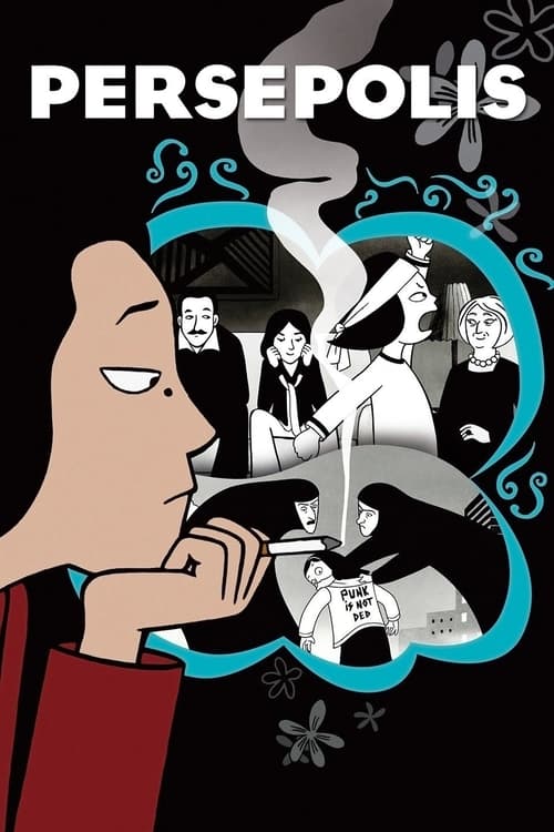
Marjane Satrapi and co-director Vincent Paronnaud translated Satrapi's black and white graphic novel into animation using flat, high-contrast 2D compositing instead of adapting toward the rounder, more marketable style typical of feature animation at the time. Production designer choices preserved the comic's stark ink linework and negative space, refusing to add texture or gradient that would have softened the political bluntness of the imagery. That fidelity to a graphic source is the craft lesson: rather than translating a comic into cinema by adding conventional depth, they kept the flatness and let silhouette and shape carry emotional weight, particularly in scenes of political violence rendered in near-abstract black shapes against white. The color sequences framing the black and white flashback are used sparingly and function almost as punctuation rather than scene setting. Designers adapting graphic novels or stylized source material should study how deliberately withholding realism preserved the original author's visual voice, proving that a two-dimensional, seemingly limited palette can carry more emotional and political charge than a fully rendered animated world.
What to watch for
Notice exactly when the film shifts from black and white to color and what emotional register that shift signals each time.
This product uses the TMDB API but is not endorsed or certified by TMDB.
Affiliate disclosure. Links on this page are affiliate links. As an Amazon Associate, Occupy Cinema earns from qualifying purchases, at no extra cost to you. Read the full policy.